The question
Clinical AI is usually judged on accuracy: sensitivity, specificity, AUC. The question a funder
actually asks is different. Does the tool save money and improve outcomes across a whole
population? This project builds the machinery to answer that, using AI triage in first-seizure
clinics as a worked example.
The model
I simulate 10,000 patient cohorts through two parallel pathways, standard care and AI-assisted
triage, and compare them. Costs are drawn from Gamma distributions fitted to NHS reference costs;
time-to-diagnosis follows LogNormal distributions grounded in the epilepsy literature; and the
shapes of the hospital-pathway parameters come from MIMIC-IV records. To compare the two pathways
fairly, each patient is routed through both using common random numbers, which cancels noise and
sharpens the contrast.
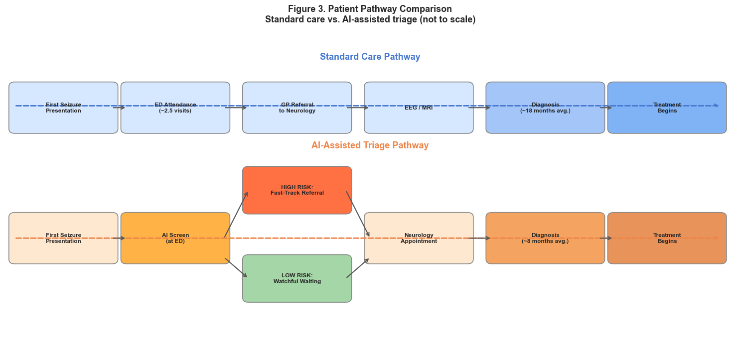
Figure 1. The two pathways. Each simulated patient runs through both standard care and
AI-assisted triage, so the difference in cost and outcome is measured patient by patient.
Bayesian updating
The AI tool does not replace the clinician; it shifts a belief. I model the tool's output as
evidence that moves a clinician's prior probability of a diagnosis to a posterior, through Bayes'
theorem. A vectorised version runs the same update across the whole cohort at simulation speed.
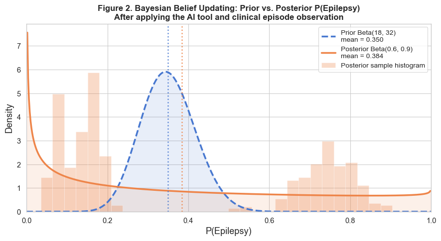
Figure 2. Prior to posterior. The AI output updates the clinician's belief, which then
changes the downstream pathway the patient takes.
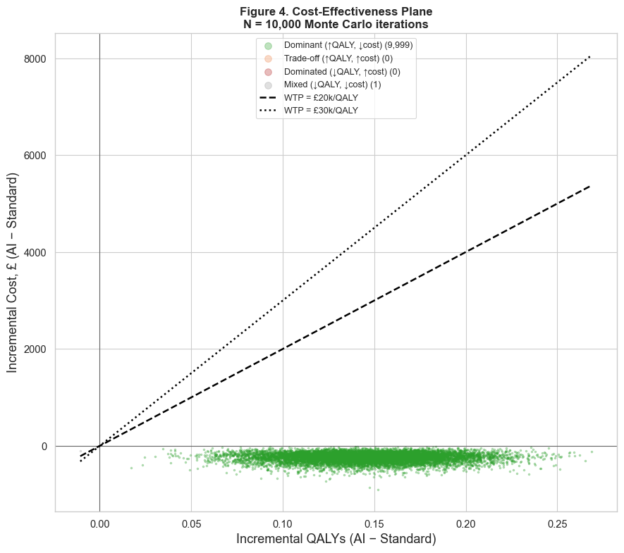
Cost-effectiveness
For each run I compute the incremental cost and the incremental quality-adjusted life years
(QALYs), and combine them into an incremental cost-effectiveness ratio (ICER). Plotting every run
on the cost-effectiveness plane, against the NICE willingness-to-pay thresholds, turns a single
verdict into a cloud of outcomes (the cover figure). That cloud is the honest picture: it shows
how often the tool is worth funding, not just whether the average run clears the bar.
What drives the result
A one-way sensitivity analysis varies each parameter in turn to see which ones move the
cost-effectiveness most. The tornado diagram ranks them, which tells a commissioner where the
uncertainty actually lives and which numbers are worth measuring better.
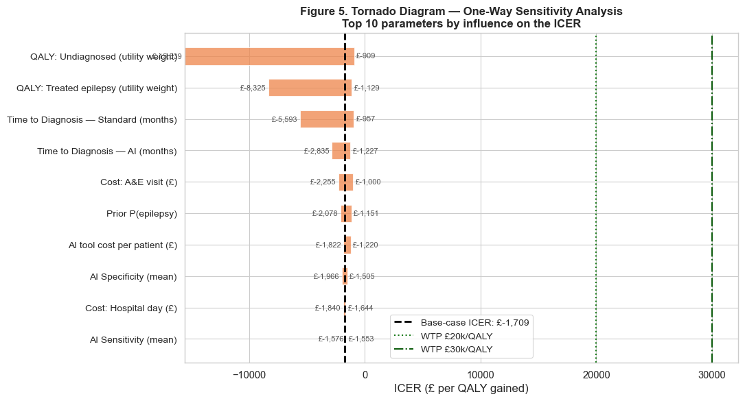
Figure 3. One-way sensitivity analysis. The widest bars are the parameters the result
depends on most.
Decision under uncertainty
The cost-effectiveness acceptability curve reads the simulation from a decision-maker's seat: at
each willingness-to-pay threshold, what is the probability the tool is the cost-effective choice?
That probability, rather than a single ICER, is what supports a funding decision.
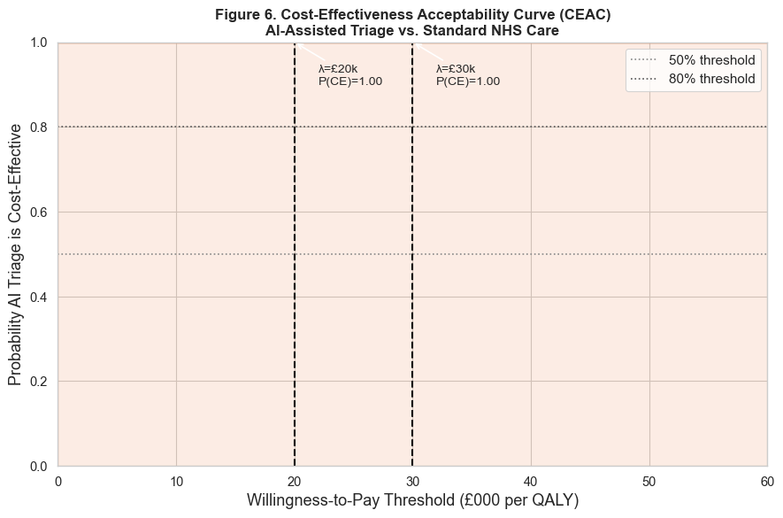
Figure 4. The acceptability curve. It maps each willingness-to-pay threshold to the
probability that the tool is the cost-effective option.
Status
The framework and code are complete and validated, with a fixed seed so every run reproduces. The
current figures use synthetic placeholder parameters while the real MIMIC-IV extracts are
integrated, so the numbers will move but the machinery will not. The full notebook and the data
provenance are in the
repository.